


Most cleaning companies track revenue and complaints. That's like driving while only watching the speedometer and the warning lights — you'll crash before you see it coming.
The pattern across cleaning businesses of all sizes is consistent: companies that track leading indicators keep contracts longer. The ones watching only lagging metrics lose accounts they thought were stable.
The difference comes down to eight specific KPIs that predict contract health weeks before problems become cancellations. Not vanity metrics or industry benchmarks — operational numbers that tell you exactly where your business is heading and what needs immediate attention.
Why standard cleaning metrics fail at scale
Small cleaning operations can survive on gut feel. You know which clients are happy, which crews work well together, which routes run efficiently. But somewhere around 15-20 contracts, that mental tracking system breaks down.
The owner of a 12-crew commercial cleaning company in Phoenix learned this the hard way. Solid revenue growth, minimal complaints, decent margins. Six months later, they'd lost three major contracts worth $180k annually. The warning signs were there — gradually increasing rework rates, slowly climbing labor costs per square foot, subtle schedule creep — but scattered across spreadsheets, text messages, and crew leader notes.
This happens because cleaning businesses generate massive amounts of operational data across multiple disconnected points: Time tracking lives in punch cards or mobile apps. Quality scores sit in inspection forms. Client feedback arrives through emails and calls. Supply usage gets tracked on purchase orders. Equipment status exists in maintenance logs. Route efficiency hides in GPS data or paper schedules.
Each data source tells part of the story. None show the full picture. By the time problems show up in revenue or complaints, the damage is already done.
The 8 KPIs that actually predict contract performance
Certain metrics consistently predict whether contracts will renew, expand, or terminate. These aren't theoretical — they're the numbers that well-run operations track daily.
Stop losing bookings in operational chaos.
Wipyly helps you manage, confirm, and optimize every cleaning appointment efficiently.
- Centralized booking management
- Automated client notifications
- Staff scheduling & route optimization
No credit card required
1. First-Visit Resolution Rate
What it measures: Percentage of cleanings completed correctly without callbacks or rework within 48 hours.
Why it predicts performance: Rework kills margins and signals deeper problems. A dropping first-visit resolution rate means either training gaps, rushed scheduling, or crew burnout — all of which lead to contract loss.
Target threshold: Above 94% for commercial, above 92% for residential Alert trigger: Any week below 90% or a downward trend over 3 weeks Data source: Callback logs, client complaints, crew return visits
A medical office cleaning company in Tampa watched their first-visit resolution drop from 96% to 91% over two months. They chalked it up to seasonal adjustment. Three months later, they lost their largest contract — the client had been quietly documenting issues the entire time.
2. Labor Cost per Square Foot
What it measures: Total labor hours × hourly rate ÷ square footage cleaned
Why it predicts performance: This efficiency metric reveals whether you're making money or slowly bleeding out. Rising labor costs mean crews are taking longer, routes are inefficient, or scope creep is quietly happening.
Target threshold: $0.012-0.018 for offices, $0.025-0.035 for medical Alert trigger: 15% increase over rolling 4-week average Data source: Timesheets, contract square footage, payroll
3. Client Touch Frequency
What it measures: Proactive client contacts per month — not responses to complaints
Why it predicts performance: Silent clients become former clients. Regular touchpoints catch problems before they escalate and build enough relationship friction that switching feels like a hassle.
Target threshold: Minimum 1 proactive contact per month for key accounts Alert trigger: No contact in 21 days for top 20% revenue accounts Data source: CRM logs, email records, call logs
Contracts with monthly proactive contact renew at 85%+. Those with only reactive communication sit around 60%. That gap is almost entirely relationship management.
4. Crew Stability Score
What it measures: Percentage of scheduled shifts covered by assigned crew vs. substitutes
Why it predicts performance: Clients notice crew changes more than operators expect. Substitutes miss location-specific requirements. High turnover leads to quality drops and client frustration that builds quietly until they find someone else.
Target threshold: Above 85% regular crew coverage Alert trigger: Below 80% or more than 3 crew changes in 30 days per account Data source: Schedule assignments, actual shift coverage
5. Supply Consumption Variance
What it measures: Actual supply usage vs. budgeted per square foot
Why it predicts performance: Sudden spikes indicate waste, theft, or undertrained crews. Drops suggest corners being cut. Either direction damages margins and quality.
Target threshold: Within 8% of budget Alert trigger: Variance exceeding 15% or opposite-direction swings week-to-week Data source: Inventory systems, purchase orders, crew supply requests
One operation found $800/month in oversupply usage at a single account. The crew was using triple the necessary product because nobody trained them on dilution ratios after switching suppliers.
6. Schedule Adherence Rate
What it measures: Percentage of cleanings started within a 30-minute window
Why it predicts performance: Commercial clients plan around cleaning schedules. Inconsistent timing disrupts their operations, and over time it becomes a renewal dealbreaker — even if quality is otherwise fine.
Target threshold: 95% on-time starts Alert trigger: Below 90% weekly, or any single account below 85% Data source: Clock-in times, scheduled start times, GPS check-ins
7. Quality Score Trend
What it measures: Rolling 30-day average of inspection scores
Why it predicts performance: The trend matters more than the absolute number. Gradual quality decline happens slowly enough that clients don't complain — they just quietly decide not to renew when the contract comes up.
Target threshold: Maintain above 85%, with focus on direction not just the score itself Alert trigger: 5% decline over 30 days or falling below 80% absolute Data source: Inspection forms, client feedback, photo documentation
8. Equipment Downtime Impact
What it measures: Revenue at risk when equipment fails
Why it predicts performance: One broken floor machine shouldn't stop operations. High downtime impact signals poor backup planning and operational fragility that compounds over time.
Target threshold: No single equipment failure affecting more than 5% of weekly revenue Alert trigger: Any equipment limiting more than 10% of scheduled work Data source: Equipment logs, schedule adjustments, rental records
8. Equipment Downtime Impact
This KPI helps you quantify operational fragility and prioritize backups or rentals before outages affect service.
Building a cleaning KPIs dashboard that crews actually use
Raw KPIs mean nothing if nobody sees them. The challenge isn't collecting data — it's presenting it in a way that makes busy operators take action.
Dashboard Layout Principles
-
Morning snapshot view Shows only critical alerts and daily priorities. No analysis paralysis.
-
Account health view Groups KPIs by client account to spot at-risk contracts quickly.
-
Crew performance view Individual and team metrics for supervisors to coach effectively.
-
Trend analysis view Week-over-week and month-over-month comparisons for strategic planning.
Sample Daily Operations Dashboard
| Priority Level | KPI | Current | Target | Status | Action Required |
|---|---|---|---|---|---|
| CRITICAL | First-Visit Resolution | 89% | >94% | 🔴 | Review today's rework list |
| WARNING | Medical Building Labor $/sqft | $0.041 | <$0.035 | 🟡 | Check crew times at location |
| MONITOR | Schedule Adherence | 93% | >95% | 🟡 | Review tomorrow's routes |
| GOOD | Client Touch - Top 20 | 18/20 | 20/20 | 🟢 | Contact 2 remaining this week |
| GOOD | Crew Stability | 87% | >85% | 🟢 | No action needed |
The key is prioritizing by business impact, not just threshold breaches. A labor cost spike at your biggest account matters more than a minor schedule slip at a small location.
Data Collection Without the Nightmare
Start with what you have. Don't wait for perfect systems. Pull from existing timesheets, schedules, and complaint logs.
Automate gradually. Begin with manual weekly updates, then automate the highest-value metrics first.
Delegate collection. Assign specific metrics to supervisors who already touch that data anyway.
Use simple tools first. A Google Sheet with forms beats complex software that nobody actually uses.
A 20-crew operation started with a weekly Google Sheet that took about 30 minutes to update. Six months in, they'd automated roughly 60% of data collection through simple integrations. The manual start taught them what actually mattered before they invested in anything heavier.
Start with what you have.
Visualize the data flow from sources to dashboard to alerts to actions.
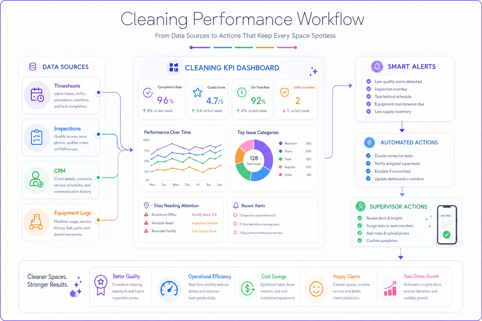
A compact workflow diagram helps teams understand where each metric comes from and who acts on it.
Threshold alerts that prevent surprises
Numbers on a dashboard don't fix problems. Alerts that trigger specific actions do.
Alert Hierarchy
Level 1 - Immediate: Text owner and ops manager instantly
-
First-visit resolution below 85% on any given day
-
Key account with no contact in 30 days
-
Equipment failure affecting more than $5k in weekly revenue
Level 2 - Daily Review: Morning dashboard flags
-
Labor costs exceeding 15% variance
-
Quality scores trending down 3 days in a row
-
Schedule adherence below 90%
Level 3 - Weekly Planning: Topics for management meetings
-
Supply consumption patterns
-
Crew stability trends
-
Overall margin direction
Making Alerts Actionable
Bad alert: "Quality score is low" Good alert: "Building A quality dropped 8% — inspect tomorrow morning"
Bad alert: "Labor costs are high" Good alert: "Crew 3 exceeded budget 3 days straight at Location X — review route with supervisor"
The difference is specific location, specific responsibility, specific timeline.
Templates for systematic improvement
Once you identify problems through KPIs, you need repeatable processes to fix them.
Rework Investigation Template
When first-visit resolution drops:
-
List all rework incidents from the past week
-
Categorize
Training, Time, Tools, or Communication
-
Identify the top 2 categories
-
Create specific fixes — not "train better" but "add bathroom checklist to Location B"
-
Assign an owner and completion date
-
Track resolution rate over the next 2 weeks
Client Recovery Workflow
When client touch frequency falls behind:
-
List all untouched accounts by days silent
-
Prioritize by revenue and contract end date
-
Assign specific outreach — not "check in" but "discuss spring floor project"
-
Schedule follow-ups in the calendar immediately
-
Document conversation outcomes
-
Set the next touch reminder before closing the call
Labor Efficiency Analysis
When labor cost per square foot spikes:
-
Pull time logs for the affected location
-
Compare to similar properties
-
Check for scope creep, access issues, supply problems, or crew experience gaps
-
Test fixes across the next 3 visits
-
Measure improvement or escalate to ops review
When labor cost per square foot spikes:
How AI-powered platforms change KPI tracking
Manual tracking fails somewhere around 10 contracts. Not because operators aren't trying — the data just lives in too many places and changes too quickly to keep up with manually.
Modern operational software changes this by centralizing data collection and automating calculations. Instead of pulling timesheet data from one system, quality scores from paper forms, and client contacts from memory, AI-powered platforms connect these streams automatically and surface patterns that are nearly impossible to catch manually — like how Tuesday route delays tend to predict Thursday quality issues, or how specific crew pairings affect supply usage over time.
But the real value isn't just automation. It's that the platform triggers action. Low quality score? Automatically schedule an inspection. Rising labor costs? Flag specific crews for supervisor review. A key client going quiet? Generate a touchpoint reminder with context from the last interaction.
This isn't about replacing judgment. It's about getting the right information in front of the right person at the right time — so operators spend their energy fixing problems, not hunting for them.
Watch the trend, not the snapshot
Individual KPI readings can be misleading. Trends are what actually tell the story.
A 94% first-visit resolution rate looks fine today. But if it was 97% last month and 95% last week, something is slowly breaking. One bad week doesn't mean systemic failure — unless it's part of a pattern.
Track rolling averages, not daily scores. Set alerts on direction, not just thresholds. And when you review trends in management meetings, focus on why metrics moved, not just that they moved. Rising labor costs might mean inefficiency — or it might mean you're finally cleaning to spec after months of rushing through locations.
The difference between surviving and scaling
Companies tracking these eight KPIs don't just retain contracts longer — they identify expansion opportunities faster. When you know your exact labor efficiency, you can quote new work confidently. When quality scores are visible, you can guarantee service levels without sweating it. When client communication is systematic, upsells happen naturally in conversations you're already having.
A Dallas cleaning company implemented this KPI framework when they had 8 crews. Eighteen months later they were at 14 crews with better margins than before. The difference wasn't working harder — it was knowing exactly where problems were developing and addressing them before clients noticed anything was off.
The math is pretty simple: spend 30 minutes daily reviewing KPIs, or spend 30 hours monthly replacing lost contracts. One builds a scalable operation. The other builds a job you can't step away from.
Your dashboard doesn't need to be perfect. It needs to exist, show reality, and drive action. Start with one metric, add another each week, and watch how quickly invisible problems become manageable improvements.
The contracts you save won't thank you for tracking KPIs. They'll just keep renewing, referring, and growing — exactly as a healthy operation should.
Ready to simplify your cleaning operations?
Join 1,000+ cleaning businesses using Wipyly to save time, reduce scheduling conflicts, and enhance client satisfaction.